Motivation
We have placed histograms in pages as independent charts, or in-line with their corresponding time-series data. Challenges that we encounter with this approach are finding a good range to "bucket" data, and to create a readable x-axis.
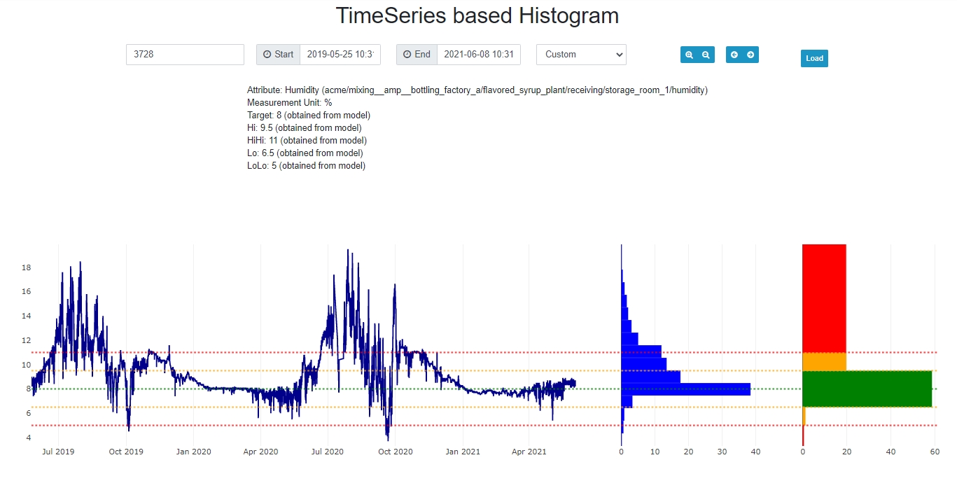
We think that a great way to deal with this is to skip the x-axis entirely and rotate the histogram 90 degrees to have a joint y-axis with the original data-set, i.e. the time-series data. Further, we place a second histogram into the collection that summarizes data based on limits, which can be defined in the model for each and every attribute.
Solution
This study allows the selection of an attribute and a time range and plots 3 charts: time-series data, a histogram with evenly spaced buckets, and a histogram based on limits.
Resolution of the evenly spaced histogram can range from 2, 4, 8, ... up to 56 buckets - based on sampling for 128 buckets and joining adjacent buckets, creating counts that correspond with powers of 2.
We use newly available api routes to retrieve limits for attributes directly from the model. This works great.

Usage
To install the extension you need access to the administrator section of your CMS:
- Grab the zip file below and drag it into the Extensions->Manage->Install page.
- Access the Time-Series based Histogram component by browsing to ... thinkiq.net/?option=com_tsbasedhistogram.
- Even better, create a menu link.
Download extension package here: tsbasedhistogram.zip
Under the Hood
There are 2 main contributions in this study:
- We introduce a simple counting algorithm in js that computes the time-in range for individual buckets. This includes crossing boundaries and interpolating the correct intersection timestamps. Futher, we historize for 128 evenly spaced value ranges by default, and then combine neighbors to create histograms as needed for either 64, 32, 16, 8, 4, or 2 horizontal bars. 16 seams to look best.
- There is a lot of goodies in the plotly implementation for this visualization:
- we use 3 sub-charts with a joint y-axis
- we render horizontal lines to illustrate limits
- we control individual colors for the limits histogram
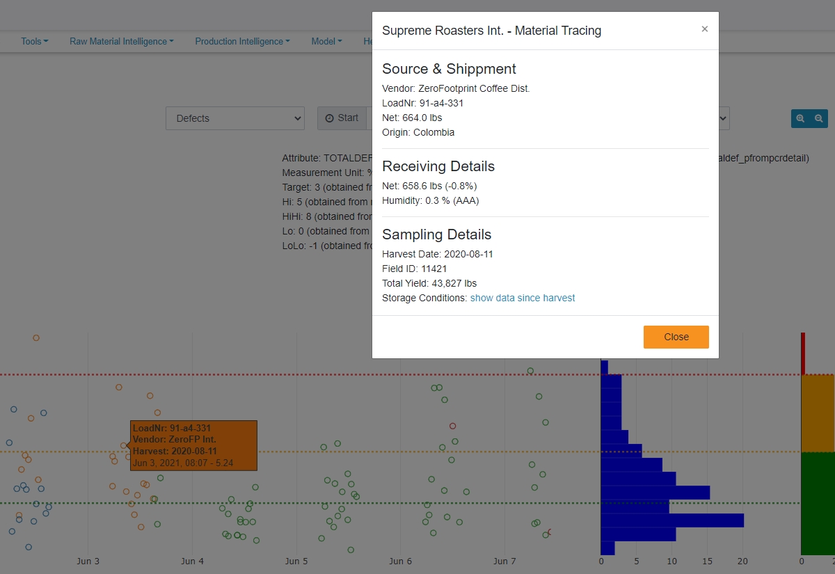
- text attributes can be passed with the trace to create rich hover templates (example below)
- colors can be passed to render non-interpolation points in different colors achieving a group-by coloring (example below)
- a click event can be passed to display pop-ups on click of individual points (example below)
- the ts-chart is rendered as dots for no-interpolation attributes, and as a continuous line for all other interpolation methods
Extensions Example for Color Groupings, Hover-Template, and Click-Events

This example shows usage of group-by colors, a hover-template with additional meta-data, and a pop-up that is triggered by click events.
